ggplotting power curves from the simr package
The R package ‘simr’ has greatly facilitated power analysis for mixed-effects models using Monte Carlo simulation (which involves running hundreds or thousands of tests under slight variations of the data). The powerCurve function is used to estimate the statistical power for various sample sizes in one go. Since the tests are run serially, they can take a VERY long time; approximately, the time it takes to run the model supplied once (say, a few hours) times the number of simulations (nsim, which should be higher than 200), and times the number of different sample sizes examined. While there isn’t a built-in parallel method, the power curves for different sample sizes can be run separately, and the results can be progressively combined as each component finishes running (see tutorial). The power curves produced by simr are so good they deserve ‘ggplot2’ rendering. So, here’s a function for it.
# Plot power curve. This function plots the output from simr::powerCurve() # or from combine_powercurve_chunks() powercurvePlot = function( powercurve, # Format interactions interaction_symbol_x = TRUE, # Value(s) to which the X axis should be expanded x_axis_expand = NULL, # Approximate number of X-axis levels number_x_axis_levels = NULL ) { # Load required packages require(dplyr) # data wrangling require(stringr) # text processing require(simr) # used for summary() require(ggplot2) # plotting require(ggtext) # enable more formats and HTML code in plot title (×) require(Cairo) # plot format plot = data.frame(summary(powercurve)) %>% ggplot(aes(y = mean, x = nlevels, ymin = lower, ymax = upper, label = nlevels)) + geom_ribbon(fill = 'grey94') + geom_errorbar(colour = 'grey40') + geom_point() + # Print sample size by each point # geom_label(colour = 'grey30', fill = 'white', alpha = .5, # nudge_x = 5, nudge_y = -0.03, label.size = NA) + # Draw 80% threshold geom_hline(yintercept = 0.8, color = 'gray70', lty = 2) + scale_y_continuous(name = 'Power', limits = c(0, 1), breaks = c(0, .2, .4, .6, .8, 1), labels = c('0%', '20%', '40%', '60%', '80%', '100%')) + scale_x_continuous(n.breaks = number_x_axis_levels) + expand_limits(x = x_axis_expand) + labs(x = 'Number of participants') + theme_bw() + theme(axis.title.x = element_text(size = 10, margin = margin(t = 8)), axis.title.y = element_text(size = 10, margin = margin(r = 7)), axis.text = element_text(size = 9), axis.ticks = element_line(colour = 'grey50'), plot.title = element_textbox_simple(size = 10, width = unit(1, 'npc'), halign = 0.5, lineheight = 1.6, padding = margin(5, 5, 5, 5), margin = margin(0, 0, 1, 0), r = grid::unit(8, 'pt'), linetype = 1, fill = 'grey98', box.colour = 'grey80'), axis.line = element_line(colour = 'black'), panel.border = element_blank(), panel.grid.minor = element_blank(), panel.background = element_blank()) # Plot title, conditional on replacement of colons in the names # of interactions. # (1) If interaction_symbol_x = TRUE if(interaction_symbol_x) { plot = plot + # Display name of predictor alone in title instead of default label from 'simr' ggtitle(powercurve$text %>% str_remove("Power for predictor ") %>% # Remove single quotation marks at the beginning and at the end str_remove_all("^'|'$") %>% # Replace interaction colons with times symbols str_replace(':', ' × ')) # (2) If interaction_symbol_x = FALSE } else { plot = plot + # Display name of predictor alone in title instead of default label from 'simr' ggtitle(powercurve$text %>% str_remove("Power for predictor ") %>% # Remove single quotation marks at the beginning and at the end str_remove_all("^'|'$")) } # Output plot }
A usage example
Hide
library(lme4)
library(simr)
library(ggplot2)
# Toy model with data from 'simr' package
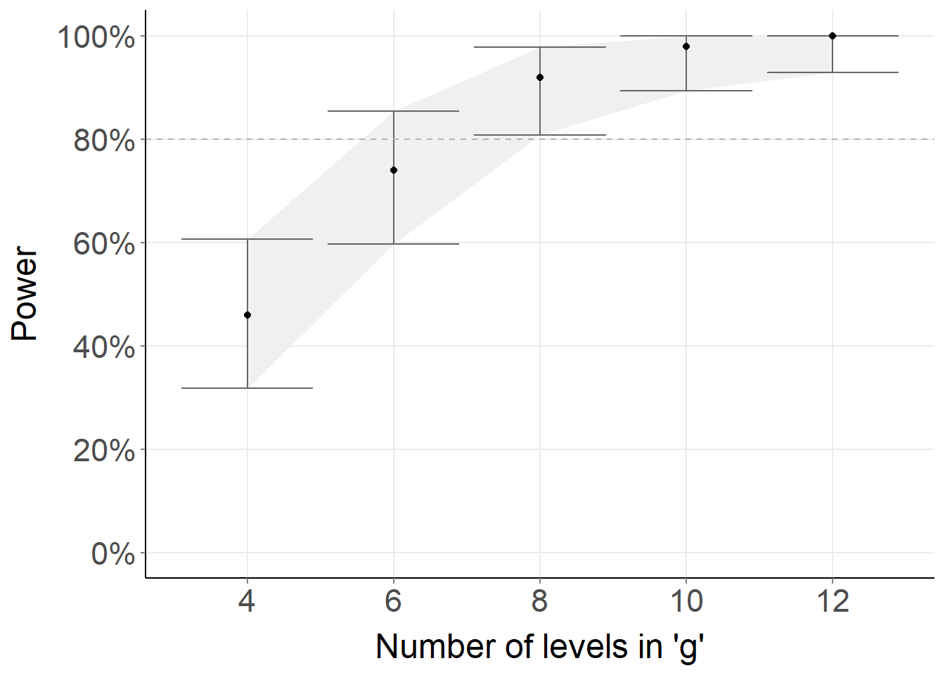
fit = lmer(y ~ x + (x | g), data = simdata)
# Extend sample size of `g`
fit_extended_g = extend(fit, along = 'g', n = 12)
fit_powercurve =
powerCurve(fit_extended_g, fixed('x'),
along = 'g', breaks = c(4, 6, 8, 10, 12),
nsim = 50, seed = 123, progress = FALSE)
# Read in custom function to ggplot results from simr::powerCurve
source('https://raw.githubusercontent.com/pablobernabeu/powercurvePlot/main/powercurvePlot.R')
powercurvePlot(fit_powercurve, number_x_axis_levels = 6) +
# Change some defaults
xlab("Number of levels in 'g'") +
theme(plot.title = element_blank(),
axis.title.x = element_text(size = 18),
axis.title.y = element_text(size = 18),
axis.text = element_text(size = 17))