US Excess Mortality
Update
I’ve redrawn the graphs here to add more information about COVID-19 deaths specifically. This post is getting a substantial amount of traffic and some of the feedback I’ve gotten suggests people were confused about what exactly was being shown. The original graphs were drawn from this CDC dataset, which led some readers to think that there was some undercounting happening. In the new versions, I’ve used a merged version of the 2014-2018 data and the ongoing 2019-2020 counts.
I’ve also put up a GitHub repository containing the code needed to reproduce the graphs here, if you’re interested in looking in more detail.
The CDC recently released some new data on mortality counts by state and cause of death in the U.S., allowing us to get a look at excess mortality patterns due to the COVID-19 pandemic. I’ve folded the data into the covdata package. As an illustration of the sort of thing you can do with it—and of the sort of thing you can do with ggplot and R—here’s a graph of various aspects of mortality in the U.S. so far this year.
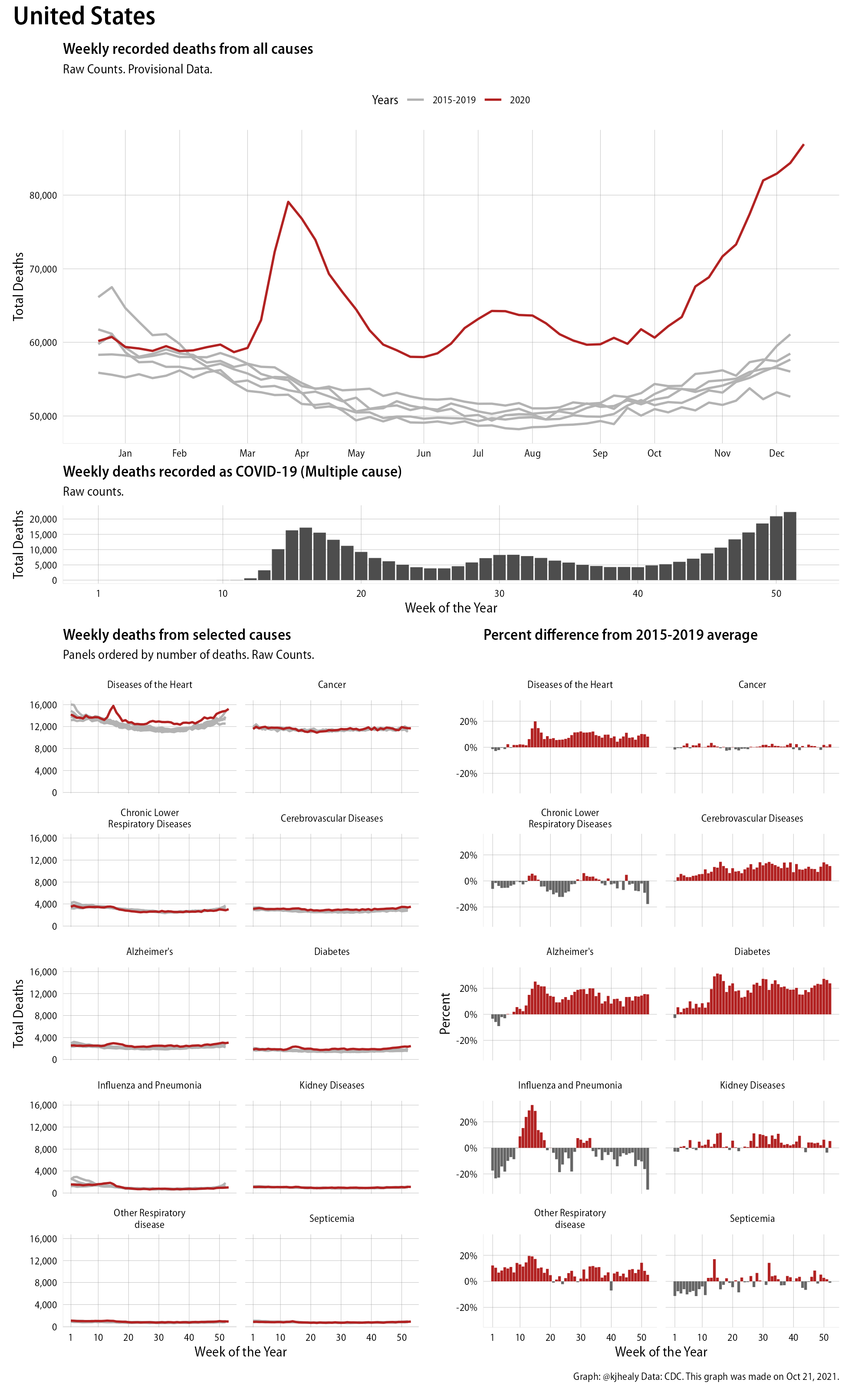
An overview of mortality in the US in 2020
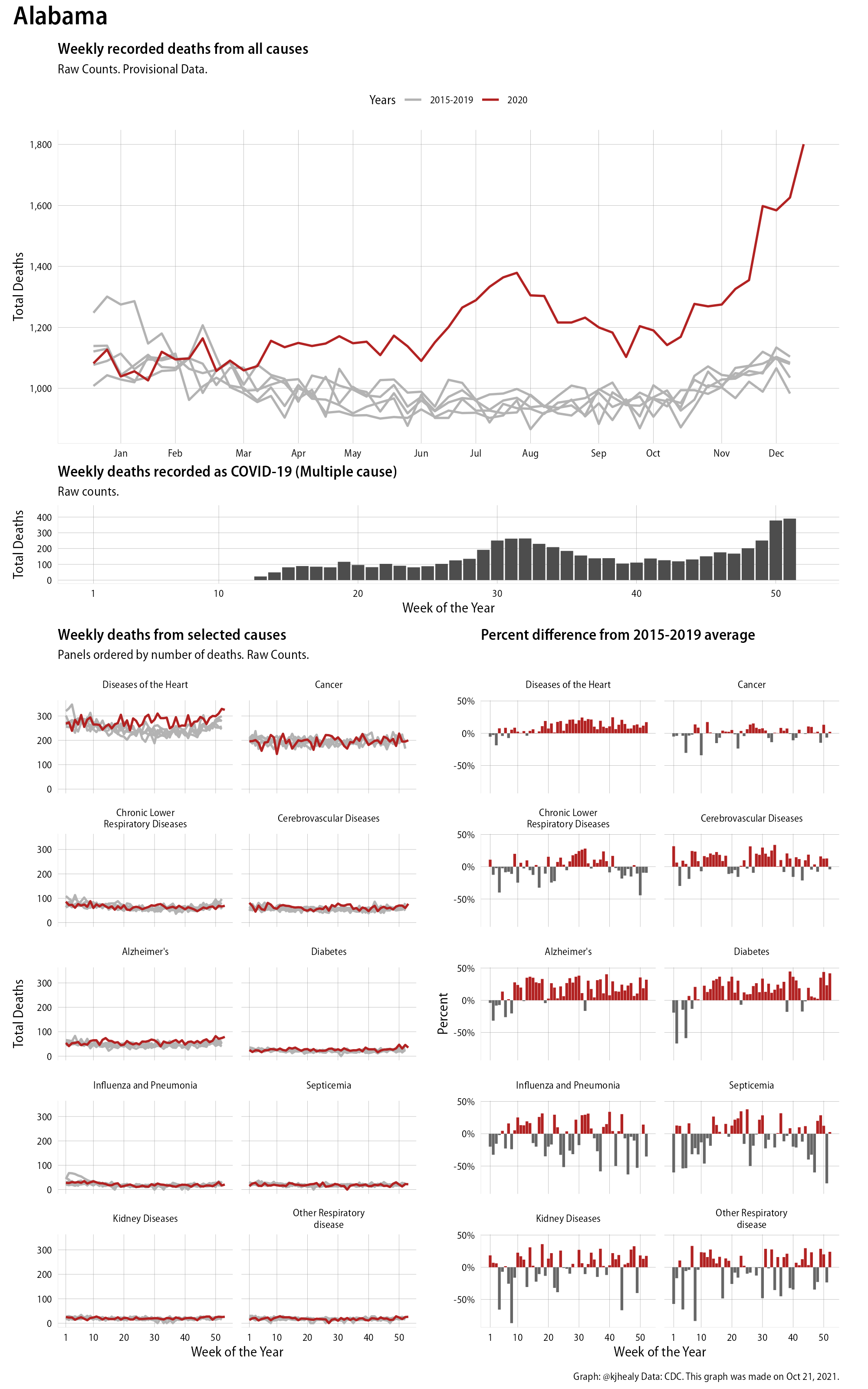
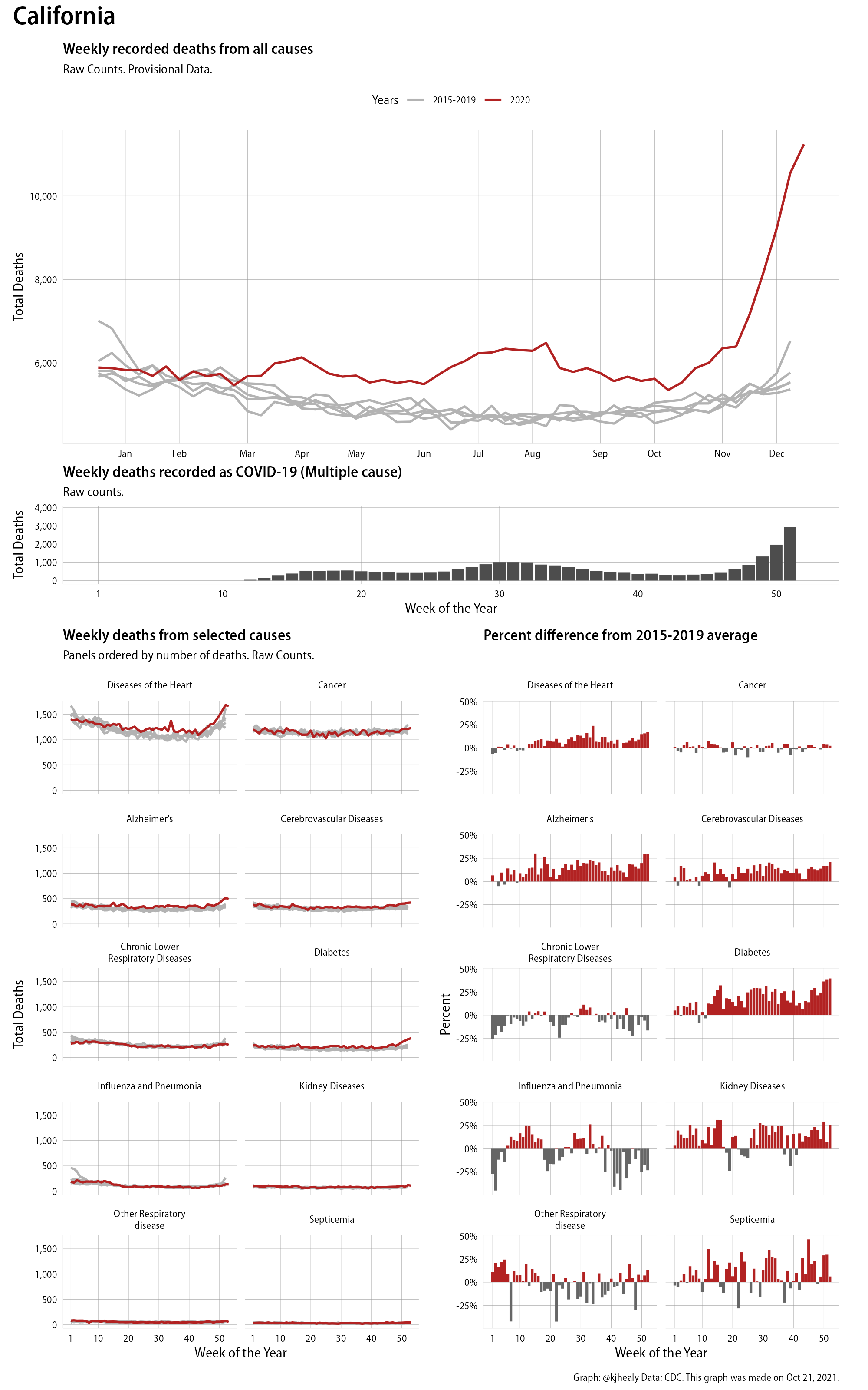
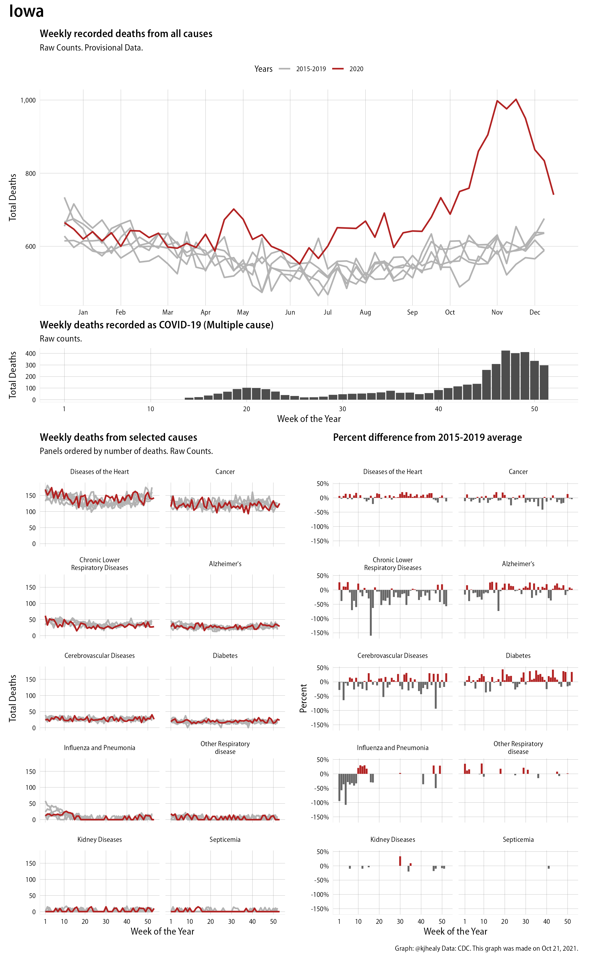
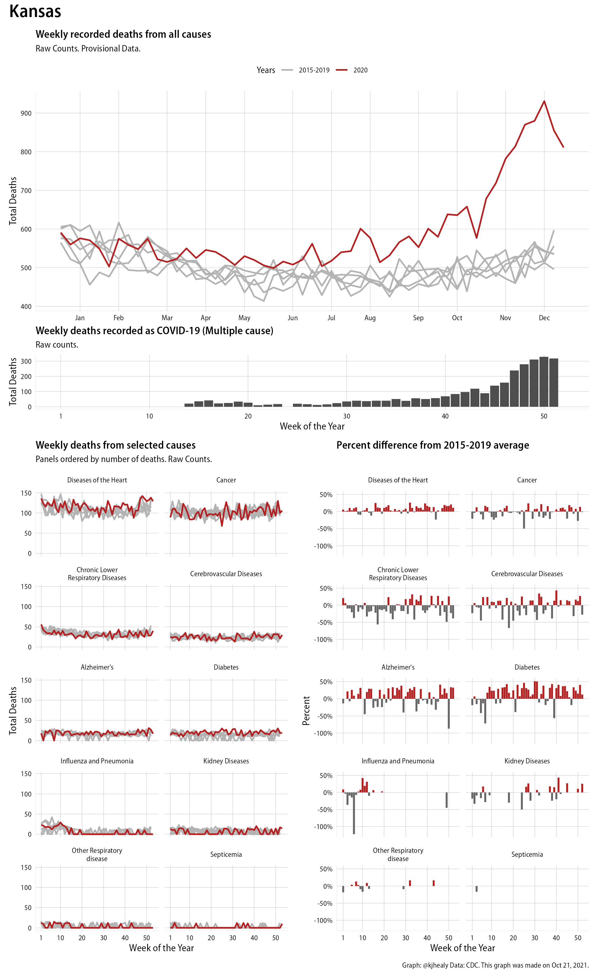
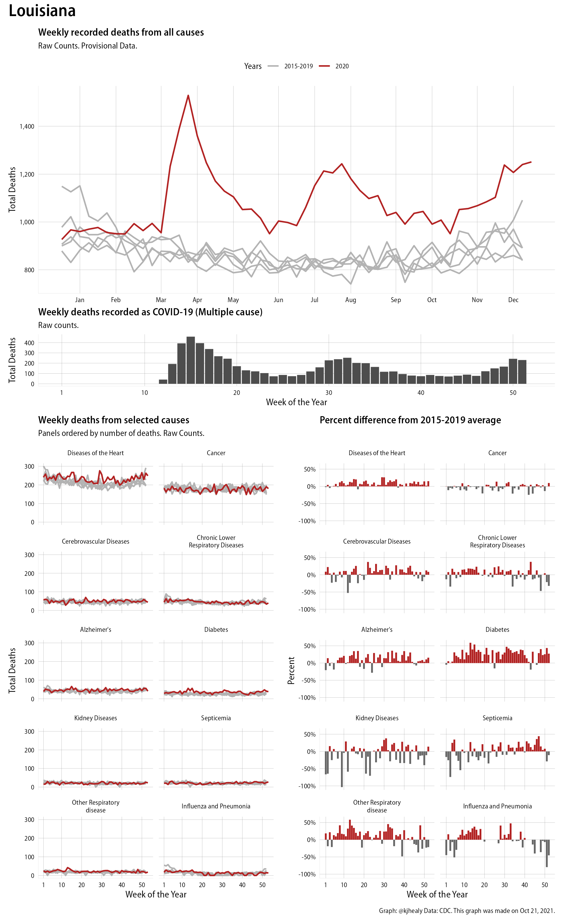
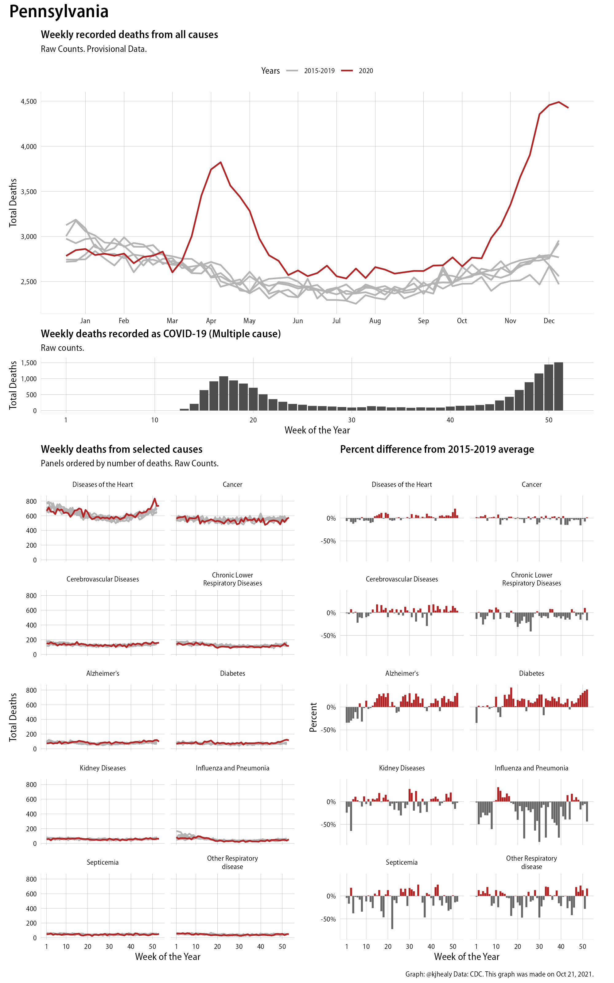
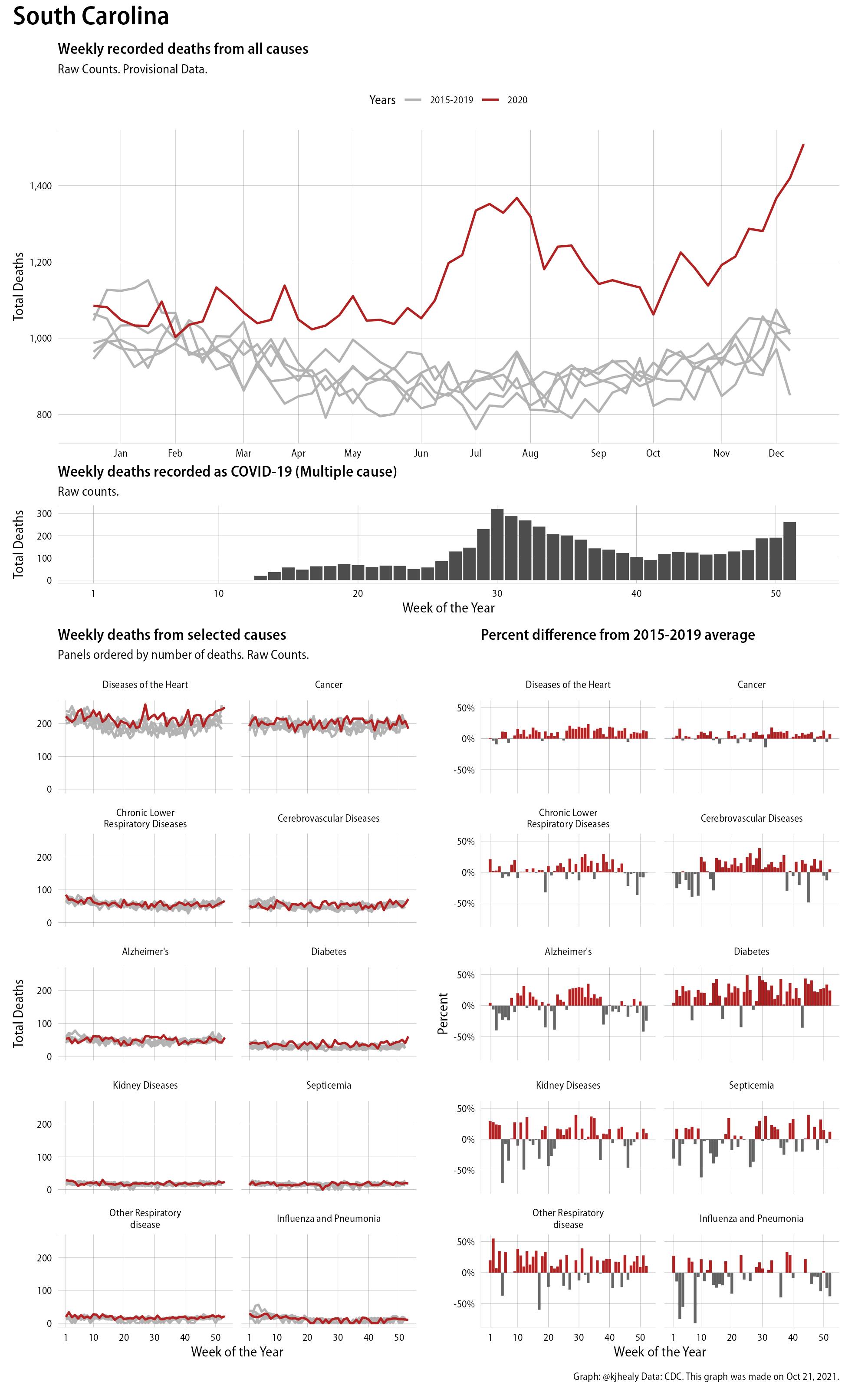
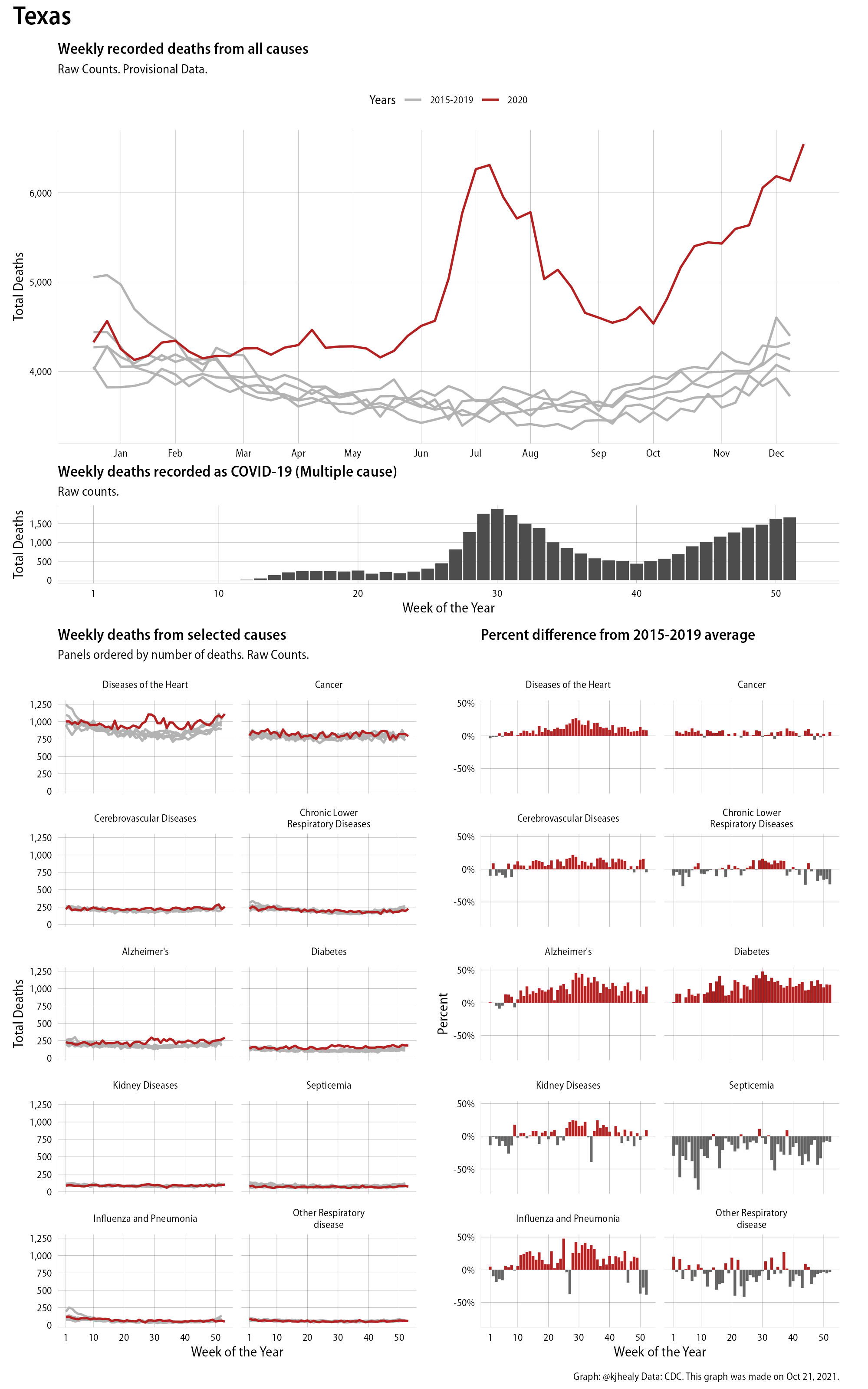
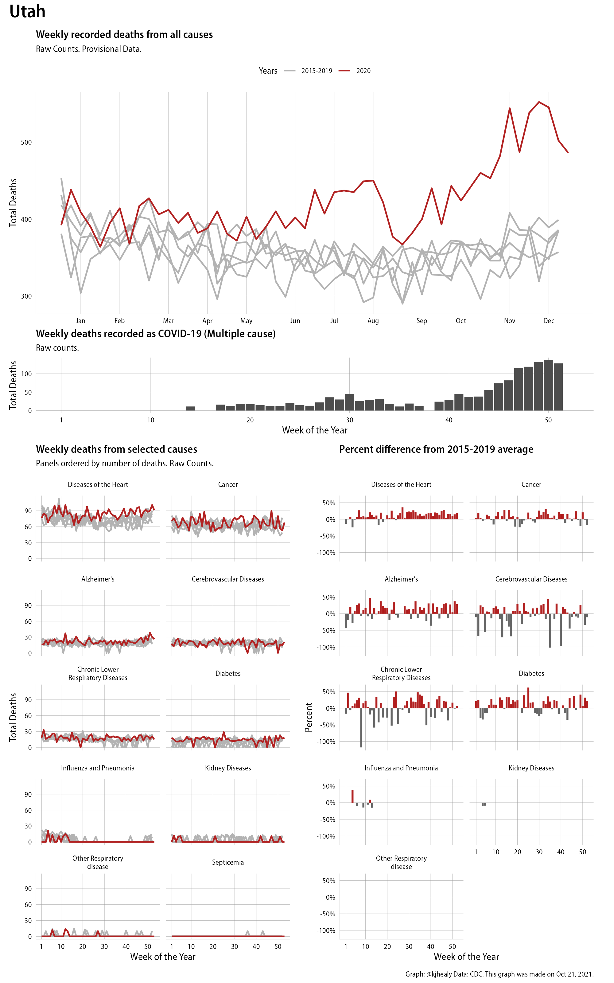
The figures have four sections. At the top is the weekly count of deaths from all causes in the United States. Counts for 2020 so far are highlighted in red. In gray are the equivalent counts for the years 2015 to 2019. More or less reliable data is available for about the first thirty weeks of the year so far, so we stop there. If you’re not familiar with mortality data of this sort, one thing that will jump out at you is its strongly seasonal character. People are more likely to die in the Winter than in the Summer. You’ll also note the relative stability of these patterns. The grey lines over the past five years are pretty steady, as the ordinary cycle of things continues. It’s this patterned character to the data that lets us infer excess mortality, when things are worse than usual for some reason. Not everything is fixed, of course. For example, the flu season in the Winter of 2017-2018 was exceptionally severe and is the reason there’s a high peak for one of the gray lines. The severity of the flu is easy to underestimate.
The second section shows the count of COVID-related deaths from week to week. The bars show the “COVID-19 (U071, Multiple Cause of Death)” ICD code.
The bottom left panel shows the same weekly data as the upper panel, but broken out by major cause of death. The causes are ordered from highest to lowest by prevalence, with Malignant Neoplasms (that is, cancer) and heart disease being the leading causes in the country in these data. The bottom right panel shows the CDC’s own calculation of the percentage difference between each cause of death so far this year as compared to its average in the five previous years. The ordering of the panels is the same, from highest to lowest overall number of deaths. But because the column charts show weekly changes, you can see where excess deaths are being registered within each cause. Thus far the comparisons are for the first thirty weeks of the year only, as reporting lags make counts from more recent weeks much noisier.
Bear in mind that these are counts and not modeled estimates. For the CDC’s own modeling of excess deaths due to COVID-19, consult their dashboards.
I think the data make some patterns quite clear. Most obviously, deaths attributed to influenza and pneumonia surge upwards beginning about ten weeks into the year. But so, too, do deaths from Alzheimer’s, hypertension, and diabetes. While I’m not a public health expert, I think the distribution of these surges is clearly suggestive of the differential impact on various groups of people, such as the elderly and those more likely to suffer from various diseases.
As I say, these data are available at the state as well as the national level. Here, for example, is the same graph for New York City:
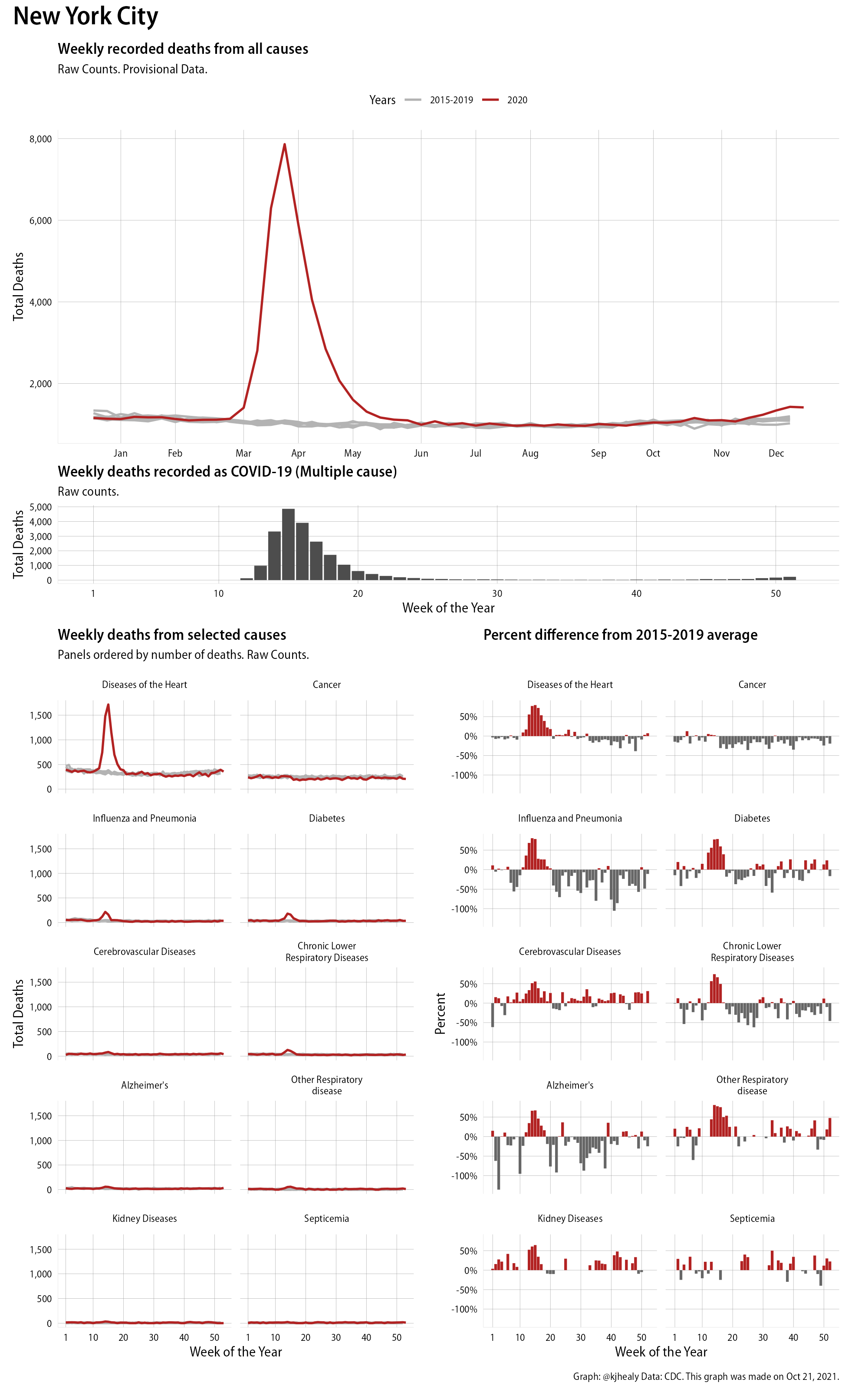
New York City
And here, for contrast, is Georgia:
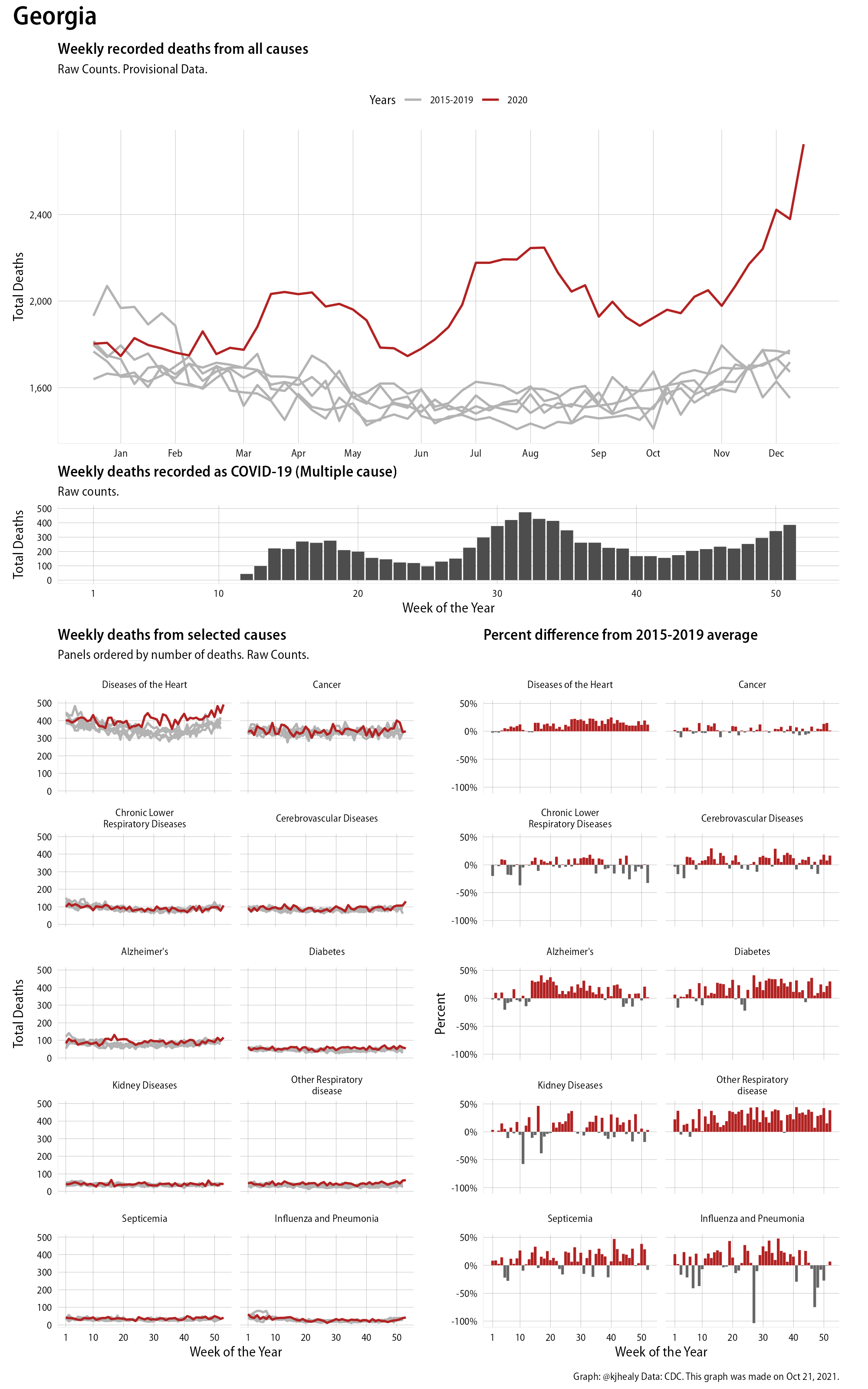
Georgia
I imagine a serious dive into this data would reveal not just structural variation across states but also evidence of differences in reporting and attribution. The data for states with smaller populations is of course much noisier than for bigger ones, as breaking things down by fourteen causes of death on a week by week basis causes you to run out of degrees of freedom pretty quickly.
These plots were all made in R and ggplot, and assembling the multiple panels was made much easier thanks to Thomas Lin Pedersen’s fabulous patchwork package. The combination of patchwork and purrr makes the production of a whole lot of plots quite efficient. I’ll put a repository with the code on GitHub once I’ve cleaned it up a little. In the meantime, here are links to graphs for all the jurisdictions in the data. Bear in mind that the graphs have different y-axes, each appropriate to the range of variation within each state and directly connected to the number of people that live in that jurisdiction. So you can’t just overlay one on top of another. For a PDF version of any one of these, replace the .png extension in the file name with a .pdf.
Gallery of Jurisdictions
Click or touch a thumbnail to see the full version and browse the gallery of images.